


A tiny writing tweak to increase sales
Plus the ad you won't wanna miss

Happy Thursday 👋,
This is a free edition. Want original models, frameworks, and mental shortcuts that make business growth faster and easier so you can sell *more* stuff? Click the little yellow button.
I heard this story once about a business that was scratching their heads trying to work out how to solve a problem. They’d decided they needed to commission a bunch of research, spend hours in focus groups and put together a whole project team.
Then, this guy takes a look at the thing and makes a tweak that takes him 10 minutes. Problem solved. Sometimes, it’s the tiny things that make a huge difference. That’s what we’re talking about today.
Let’s get into it 👇
Step 1: Understanding the customer journey
I think sometimes we hold in our mind an idea of the perfect customer.
Or maybe you don’t think about it at all, so you make the mistake of thinking the person browsing your website or page has all the time in the world. They’re reading every single bit of your well-crafted copy, they’re watching every video, and they’ve read your ‘About page’.
The reality is, that people are busy. They browse half looking at their phone, half stirring dinner. They probably haven’t looked at your ‘About page’, they probably don’t know who you are and they’ve only skimmed your website.
This is important.
The *actual* person browsing your website is nothing like the perfect person you hold in your mind and so you must adapt your approach accordingly.
Picture this: They’re not reading line for line, they’re not paying full attention, they’ve got 100 other tabs up and the dog is barking. That’s who is buying your stuff.
So we must design for that person.
Step 2: Build for busy
Build for the distracted mind.
Make your website skimmable
Make your copy short
Make your videos snappy
Make your headlines catchy.
But above all, make the buyer journey easy.
What do I mean?
Far too many websites make it hard to buy because they create friction. When somebody comes into your ecosystem (website, TikTok page whatever), they shouldn’t be scratching their heads at the buying process.
They shouldn’t have to spend 4 hours making an account, they shouldn’t have to give you every inch of data, and they shouldn’t have to spend hours trying to search for what they want.
The process of buying should be frictionless.
Say it with me f-r-i-c-t-i-o-n-l-e-s-s.
Aka it should be like sliding down a slide - weeeeeeeee. It should be as easy as physically possible to get from finding the thing they want to buy to press ‘pay.
And how do you do that exactly? Well, let me show you some examples.
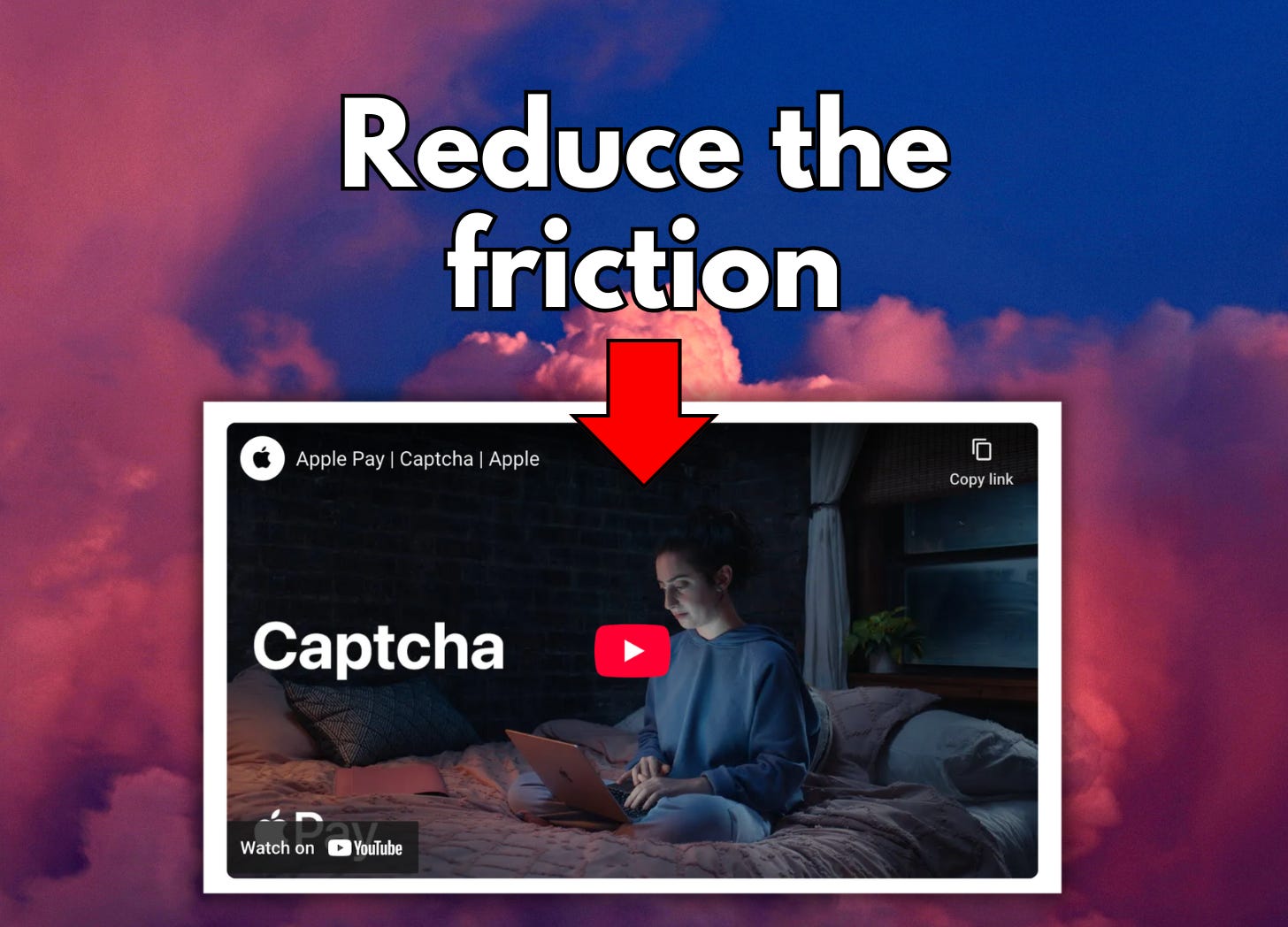
Step 3: Frictionless design
Pre-populated field, password saving, face recognition, finger recognition, apple pay.
These are all examples of frictionless design, the best explanation I’ve ever seen on frictionless design is this ad.
I’ve watched that again for the first time in ages — my response ‘sooooooo good’.
This is how people buy. They’re sat in their bedroom, laptop open. Maybe they had it on their to-do list, maybe they’ve seen something on TikTok and grabbed their laptop because it’s easier.
But they’re sat in their bedroom, in their comfies, trying to buy the thing. So make it easy.
Here are some more examples of making things easy:
You see that ‘B’. That’s what I’m talking about. Press ‘B’ and you go to the checkout page. Why does this work? Because some people don’t need convincing by a landing page that they should buy this thing.
They’re ready to pay — so let them.
Of the people that land on your page, a proportion have already decided to buy. Maybe they’ve been here before, maybe they contemplated it last week and now they’re ready to commit.
Whatever it might be their intention is clear and you need to serve that intention. Allow them to buy as quickly as possible.
More examples:
Help them visualize when they’re getting the thing
Show them the delivery method *first* (before asking for their details) and (here’s the important bit) tell them when they could have their item (you see that delivery: tomorrow)
Present bias is a real thing in science (I’ve run tests on increasing the present bias before and it increases conversions). It means people want things nowwwwwwww, showing what they could have as early as tomorrow increases motivation to purchase.
Most people want the thing but don’t want to go through the hassle of ordering the thing. But you can make them feel like they are closer to their goal, in theory, it’ll motivate them to not abandon their cart.

Don’t overwhelm them with fill-in-the-blanks
Make it a step-by-step process. One daunting thing is sitting in front of a long-form you need to fill in. We skim things.
A long-form we look at, make a mental assessment, and ‘eurgh, I’ll do that later’.
If you can present that same form, but step-by-step, so screen by screen, you mitigate the risk of overwhelm and increase your chances of getting them to buy.

Step 4: Walk through your buyer’s journey
I’ve been revamping the Medium Blueprint landing page.
You’ll see ‘get instant access’ is the first button you come across. That’s because as discussed, people are at different stages in their buying journey.
Some are ready to buy, so I have to cater for that. For the others, they can continue to scroll.

Spend time walking through your customer journey.
Go on *your* website or TikTok or whatever you sell things and walk through the journey, click through the pages you have to go through to buy.
And have one question in your mind: how can I reduce the friction?
Do that and you’ll have more people buying your stuff.
That’s all for today.
Much love,

Eve
Founder - Part-Time Creator Club